SEO stands for “Search Engine Optimization”. Basically, it’s the process of getting your site to show up on the major search engines such as Google and Bing thus getting you found by your potential customers. Web pages from websites such as yours are ranked based on what these search engines consider most relevent to users.
Google, the world’s most popular search engine is constantly changing its algorithms to find the best results. Google is now attempting to take what people like and dislike about websites and code that into its algorithms.
Where Google used to only ask “is this page a good match for the searcher’s keywords?”, they now also ask “is the searcher going to like this page?”.
This means the quality of your website is more important than ever.
Common Problems with Underperforming Websites
Confused, cluttered page layout.
Poor / ugly color choices and background colors that make text hard to read.
Amateurish design (This can also label your company as amateurish as well).
Confused overall message (The user MUST know what to do and where to find things).
No focus (The page shouldn’t try to do too much).
No Calls To Action
If your current website is suffering from any of these problems, it’s probably time for a website redesign.
Website Redesign Case Study: Before & After
Let’s take a look at a recent website redesign. This website offers people from the medical field a way to get their certification online.
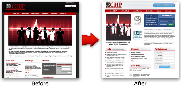
Here is a larger image of the original website:
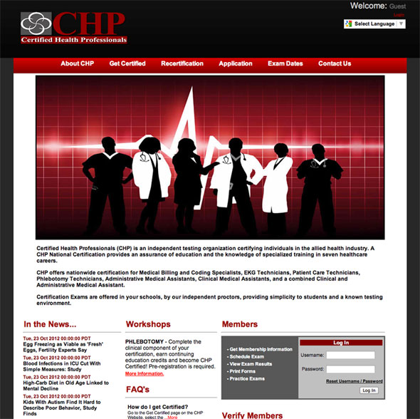
And here is a larger image of the redesigned website

Can we beautify our website & make it more effective in the process?
We’ll use our list of common website problems above and see how the original website measures up.
Confused, cluttered page layout.
One main complaint by the client was that users were not sure where to log in. Looking at the original site we determined the image was too big. On smaller computers it took up the entire page, dropping the login box below “the fold”. This forced users to scroll down the page to find the login box. With our redesigned website we now have a smaller image moved off to the side. Our login box has been brought up to the top, made more attractive and is now much more noticeable.
Poor / ugly color choices and background colors that make text hard to read.
The heavy black used on the original site makes the entire site look dark. This can be desirable for some websites but you must know the industry or field the website fits into. In this case we’re dealing with the health field. White and light colors would seem to fit better for this type of website. We have a nicer, cleaner and more open feel with the white instead of the black. It also makes their logo pop and as you can see with that login link in the top right corner of the old site, red on top of black is not easy to read.
Amateurish design (This can also label your company as amateurish as well).
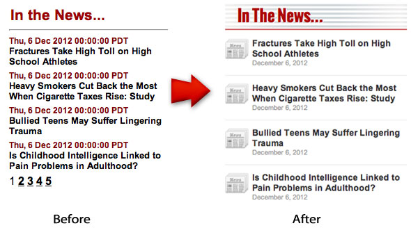
I don’t like calling anyone’s work amateurish and I’m not saying the original site is. I just want to point out the difference a little CSS styling can make. Even something as simple as a list can benefit from styling:
You need to do an honest assessment of your website. Is your site professional looking? Who built it? An office manager? A nephew? Your website is your face to the world. If it looks like it was built by an amateur, it conveys the impression that your business is run by amateurs.
Confused overall message (The user MUST know what to do and where to find things).
This goes back to what we talked about earlier- users getting confused when trying to log in to the website. Our redesigned website fixes this problem. The blue box stands out from everything else because of its color, the big “MEMBERS” label in all caps and that juicy green login button that’s just begging you to click it. These all work together to pull your eyes to that space.
No focus (The page shouldn’t try to do too much).
The original website lacks a little focus. Workshops, In The News, Members, FAQs and Verify Members are all given the same weight or importance. That’s a lot of things competing with each other and when that happens, they all start blending into each other.
No Calls To Action
If I’m a new visitor to the site where should I go? What should I do? Can you find the Call to Action on the original website? Now how about the redesigned one? If you wanted to register as a new member would you know how? We already know they were having trouble logging in. Figure out what you want the user to do and then design the web page to help them do it.
As you can see, there are huge benefits to a website redesign. It can help you acquire more customers through better SEO and help keep them on your website through better usability design. If you’d like to find out about redesigning your own website, please contact us or request a quote.
I’d love to hear your thoughts and opinions on our website redesign in the comment section below.
